top of page


OVERVIEW
The Alabama Booksmith is a brick-and-mortar bookstore that is looking to renovate its e-commerce process. They got their start in 1990 when their owner, Jake Reiss, took advantage of the fact that there was no Barnes and Noble in Birmingham. But that advantage has since become less significant in the age of online shopping. Using design tools such as Figma, I redesigned their website to give as hospitable of an experience as the store in Birmingham itself.
ROLE
UX Designer, Web Designer
DURATION
2 Weeks

State of the old website
+ Large variety of their books upfront, being the first thing the customer sees
- All pictures of the books are unclickable and disappear quickly
.png)
No way to know where you are in the checkout process


When it comes to the Alabama Booksmith, we are targeting the careful critic
- Cares about quality
- Reads reviews and comments
- Wants to be able to compare items

The careful critic needs to know the quality of their item so they won't regret their purchase
COMPETITIVE ANALYSIS AND TAKEAWAYS

- Competitors take advantage of the star rating system to give the user a chance to compare books
- Comments were very present for the user to gain more insight from other opinions
- All competitors had visual system to show where you are in the checkout process
FRAMING THE PROBLEM
How Might We
Give the customer enough information on a book without being dull?
Show where the customer is in the process in a concise and cautious way?
IDEATION
Sketches


From the sketches, I was able to create and finalize a user flow that would be best suitable for our design and target user

Wireframing
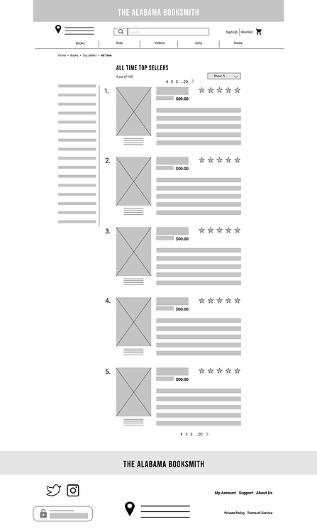
I turned my sketches into wireframes using Figma. I wanted to have every page give the user a chance to review and feel comfortable in their shopping process.

HIGH FIDELITY DESIGN
- It is important to keep the books more prominent than any text to show the variety Alabama Booksmith has to offer.

- Every book listed has a star rating along with the title and author
- Next to the image, the book has a concise summary about the book. Long enough to have the information, short enough to stay interesting

- Every one of our competitors had an About the Author section
- Suggested books to keep our careful critic on our website to compare to other books
.png)
- Comment box to leave reviews, followed by previous comments to understand the value
.png)
- Numerical system, to know exactly where our user is in the process of checking out
- Always keeping an order summary on the right
.png)
USER TESTING
The Task
Buy the top rated book of all time
.png)
.png)

100% of users completed the task with relative ease
67% stalled mulling over whether they wanted paperback or hardcover

"The ratings make the books seem popular." - User #1

NEXT STEPS
What stood out the most to me during the tests was that the price would disappear once the customer scrolled down to look at reviews. The way to solve this problem is to keep the side cart as a floating header that always stays visible in the top right.
.png)
bottom of page