top of page

OVERVIEW
To help people everywhere find a job and company they love.
Glassdoor is most well-known for its anonymous reviews for companies by former employees. Like its competitors, Glassdoor also has a social aspect and allows users to apply for jobs on its platform. My team capitalized on the search and filter functions to help job hunting while still maintaining its prism of anonymity.
ROLE:
UX Designer, Researcher
METHODS:
Comparative & Competitive Analysis, Usability Testing, Affinity Mapping, User Persona, Journey Mapping, User Flows, Accessibility Analysis, Site Mapping, Sketching, Wireframing, Prototyping & Iteration


USER INTERVIEWS
"All job searching apps are too messy to navigate." - Interviewee #2
There couldn't be a better adjective to describe job hunting than messy. Like other users I interviewed, this person was upset that job postings are unorganized, outdated, lacking details, and get lost among countless applications. Overall "agonizing."
Weren't aware Glassdoor even had a job hunting feature
.png)
75%
COMPETITIVE ANALYSIS

ESTABLISHING THE PROBLEM
Users need an efficient way to search for jobs so they can know they're compatible because finding the right job can be emotionally uncomfortable and intimidating.
How Might We
Make it easier for users to utilize Glassdoor's features?


IDEATION
Creating Solutions
1. Put jobs on the home screen and make filter and sort much more visible
+ Large enough to be seen
+ Users can pinpoint exactly what they want
- Can take up space from results
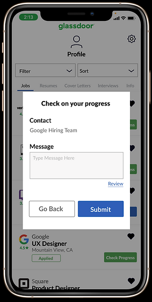
2. Users can track applications and communicate with hiring managers
+ Bridge the communication gap between applicant and company
+ Users can keep track of what and when they applied
- Communication might hurt the anonymity aspect
DEVELOPE
User Flows & Wireframing
We each conducted a design studio to produce our best big picture ideas in an efficient manner


We turned our sketches into wireframes using Figma
Listings on the front screen with clear rating
Users know what the job entails in a detailed and organized display

Users can narrow down specifics
Former "apply" CTA turns into date user applied on
TESTING - GREYSCALE
The Task
To see if users can maneuver the filter and sort functions and apply to the right job.
All users could execute the search by filtering and sorting, while verbally adding other notes.
"The system of reviewing my resume helps me feel more prepared."

66.7%
"I'd want to know similar jobs to this one after applying"

HIGH FIDELITY DESIGN
After analyzing our greyscale testing data, I took the trends and applied the findings to our mockup design.

Salary listed with the results after using the search
Check progress CTA along with date applied
Similar jobs after applying to keep the user on Glassdoor once they finish applying


Check progress CTA with direct communication to hiring team to give the user more clarity
TESTING - MOCKUP
To see if users can efficiently apply to the right job and see if they will want to check their progress to feel comfortable about it
.png)
.png)
.png)

75% found the check progress to be useful
.png)
.png)
.png)
.png)
100% users found the job apply feature easy and quick

NEXT STEPS
- Integrate onboarding tooltips to familiarize user with navigation
- Personalize the home screen towards the users to make the search as seamless as possible
100%
MARKETING
Glassdoor is the platform for transparency and honesty
With more apps becoming social, Glassdoor is unique in how they provide transparent interactions while users' anonymity will keep them honest.


bottom of page
